

A map like no other...
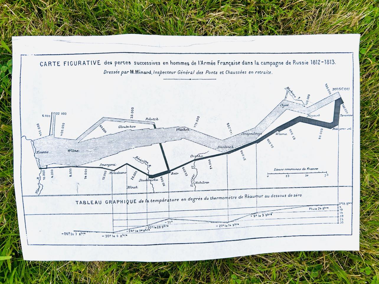
This remarkable chart is known as the Minard Map, and it visualizes Napoleon’s disastrous Russian campaign of 1812. Here are the key features of this extraordinary statistical graphic:
Geography: The map includes rivers, cities, and battle locations, all placed according to their occurrence on a regular map.
Army’s Course: The path follows Napoleon’s advance into Russia (1812) and retreat from Russia (1813).
Direction: The path color indicates the direction—gold leading into Russia and black leading out of it.
Soldiers Remaining: The path narrows to represent the human toll, with each millimeter corresponding to 10,000 men.
Temperature: The freezing cold of the Russian winter during the return trip is indicated at the bottom.
Time: Dates are shown from right to left, reflecting the campaign’s progression1.
Recent Posts
-

I Spy with my little eye.....
This Can you find all the things? Tiny hand, Tiny Rubber Duckie, Rotary Range Switch, Ignition Start …19th Jun 2025 -

? What Is It Wednesday ?
This mysterious contraption just appeared in the conference room. One minute we were arguing about w …18th Jun 2025 -

“What the Tool?! Wednesday”
We just unearthed this medieval-looking contraption from the depths of the Surplus Zone, and we thin …4th Jun 2025